- React
- NestJS
- TypeScript
Vibration Analysis Platform
An interface for transforming industrial sensor data into actionable insights
The Context
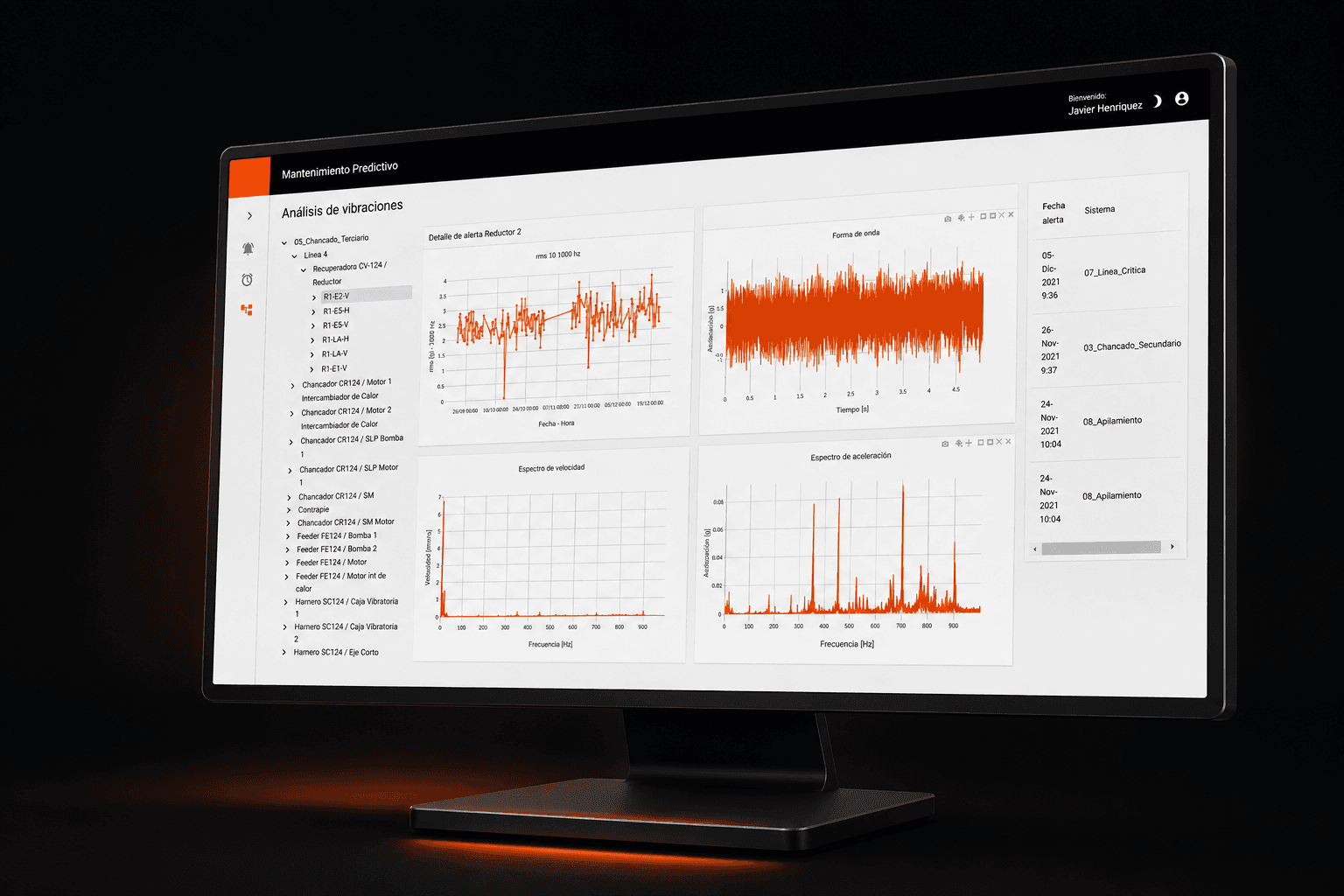
The system allowed viewing recommendations associated with potential equipment failures and consulting related sensor information.
One of the main objectives was to enable the vibration analyst to access from a single view:
• The equipment and sensor hierarchy
• Vibration data
• Analysis charts
• Recent alerts
• Criticality level
• Alert-associated information
• Actions to accept or reject an alert
The need for a unified view appears explicitly in the development history of the new vibration analysis view.
The Problem
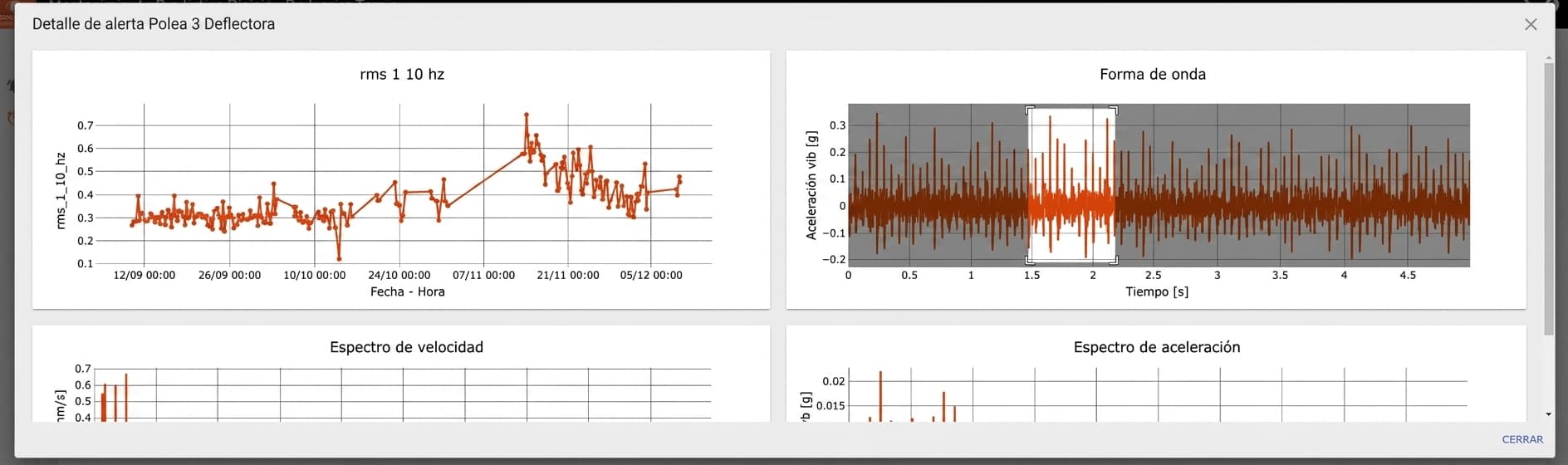
Analyzing an alert requires connecting different pieces of information: the affected equipment, the corresponding sensor, the vibration data, and the alert status.
The challenge was building an experience where these pieces were connected and the user could move from one to another without losing context.
The new view needed to allow sensor selection from a hierarchical structure and update the corresponding charts, while also displaying related alerts and enabling status management.
Create a centralized view for vibration analysis, connecting sensor hierarchy, data visualization, and alert management.
From Dashboard to Analysis Platform
The project didn't start directly with the vibration analysis view.
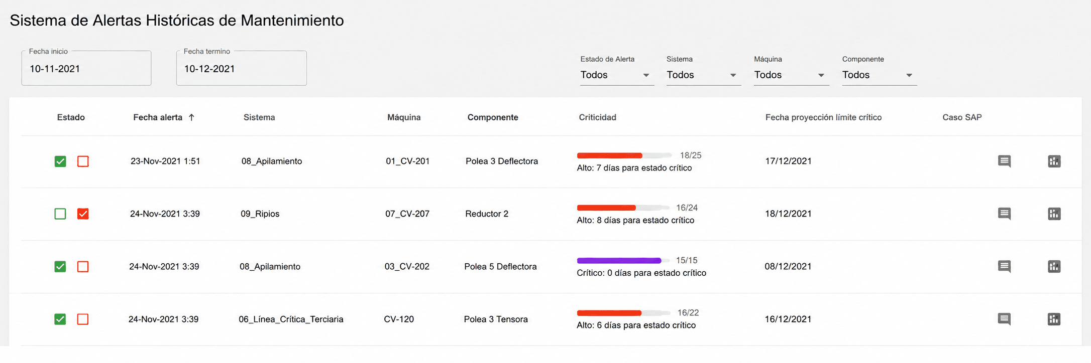
One of the first functionalities was a recommendations dashboard that allowed viewing potential failures, prioritizing alerts, and consulting their history.
Alerts could have different states, such as accepted and rejected, and the detail could include charts, comments, and SAP codes.
Designing the New Experience
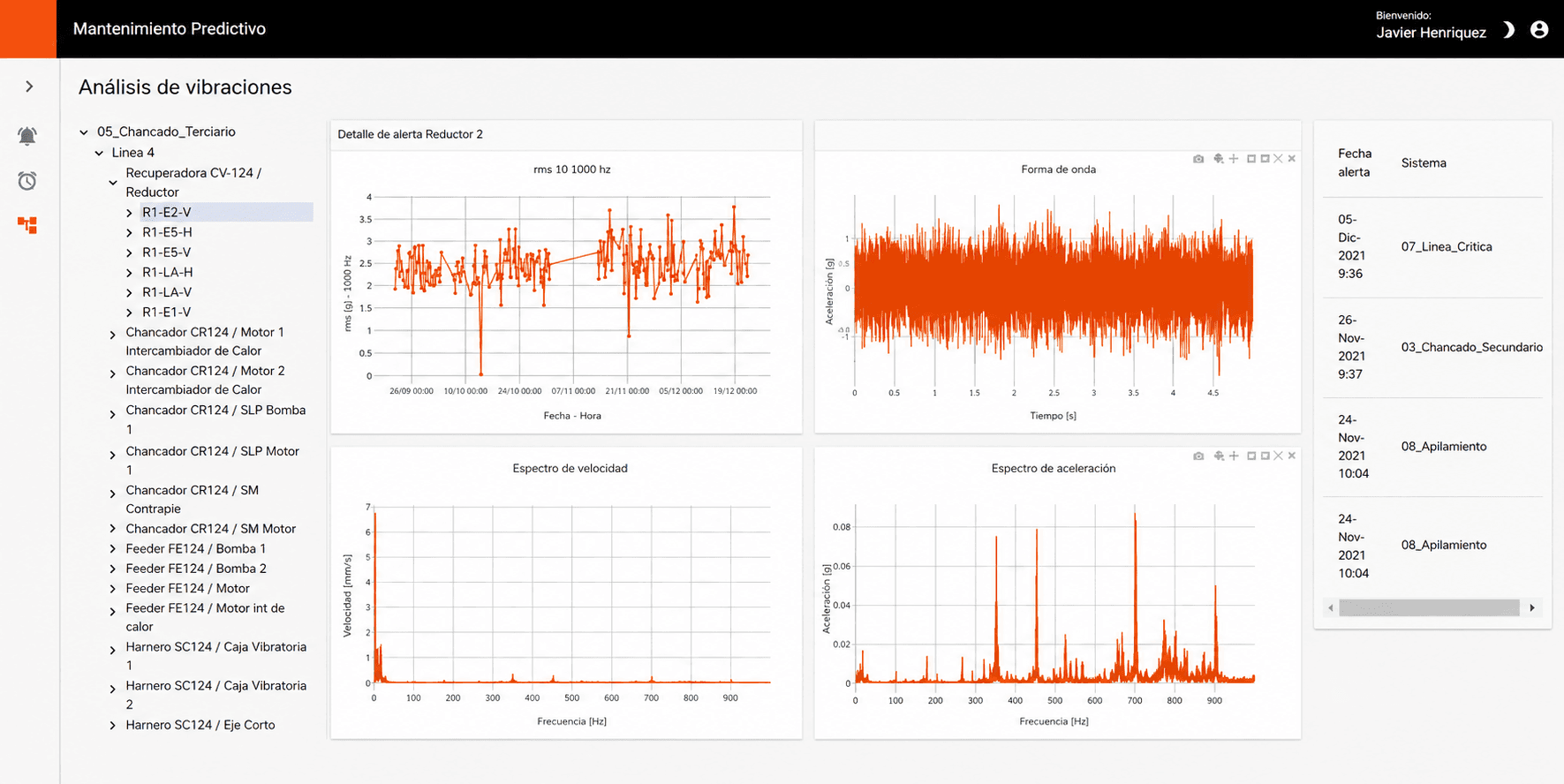
The new vibration analysis view was structured around three main elements:
- Sensor Hierarchy — Navigate from the system and its components to specific sensors
- Data Visualization — Charts showing information associated with the selected sensor
- Alerts and Actions — Recent alerts that can be selected to view information and perform actions like accepting or rejecting
A Connected Sensor Hierarchy
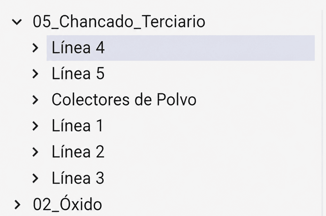
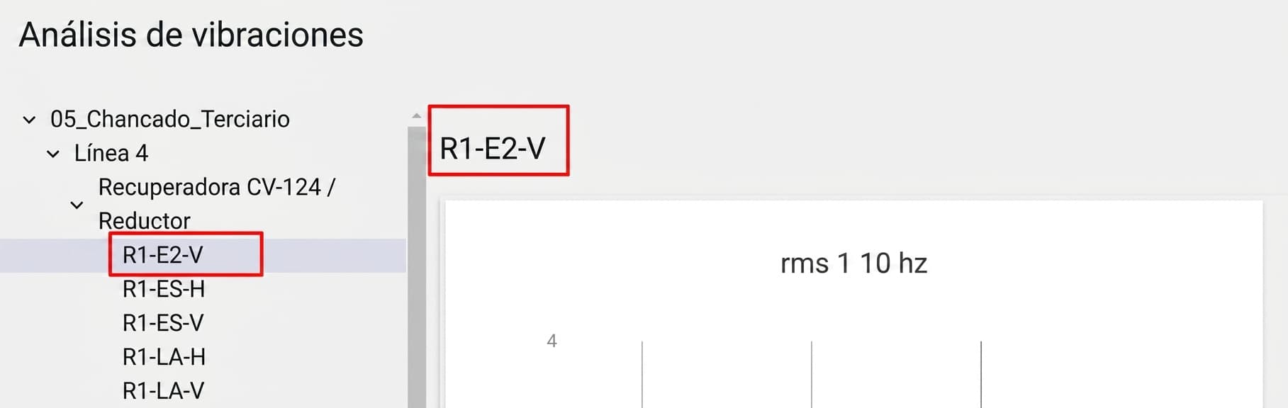
One of the main interface components was the sensor tree.
The hierarchical information had to be obtained through metadata and transformed into a navigable structure within the application.
Sensor Selection → Information Update
Selecting a sensor wasn't just a visual change.
When selecting a sensor, the application had to launch the necessary requests to obtain the corresponding information and update the charts.
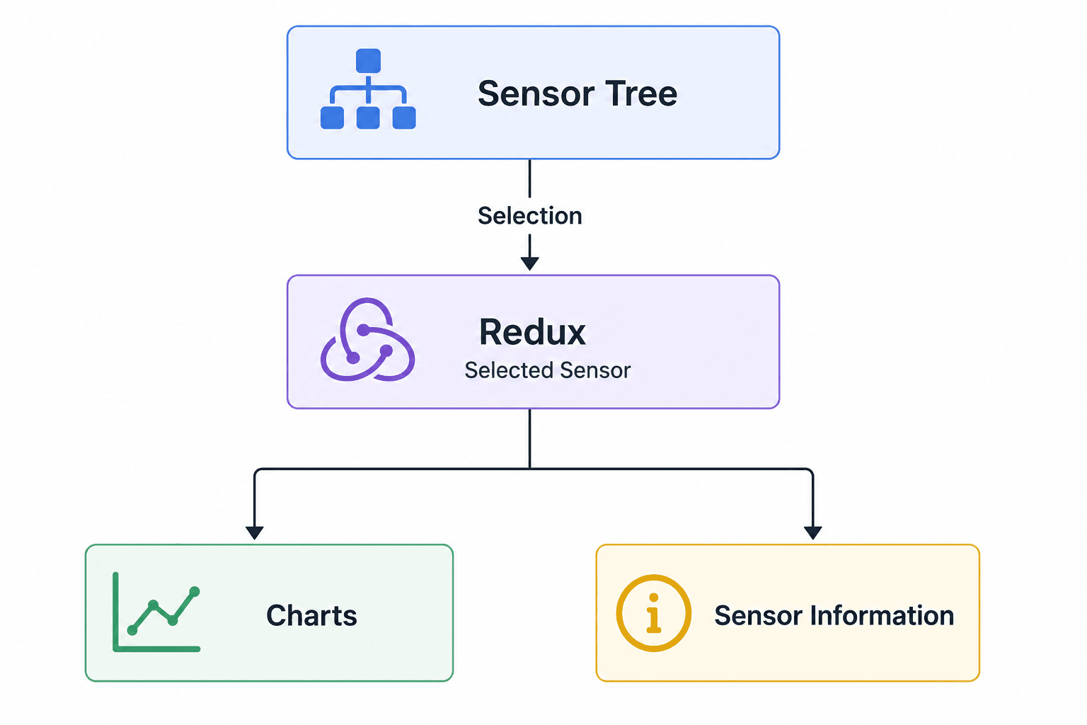
To coordinate this interaction between different components, Redux was used.
Selecting a tree element became the entry point for updating the rest of the interface.
- Select sensor → Update global state → Request data → Update charts → Display selected sensor
Data Visualization
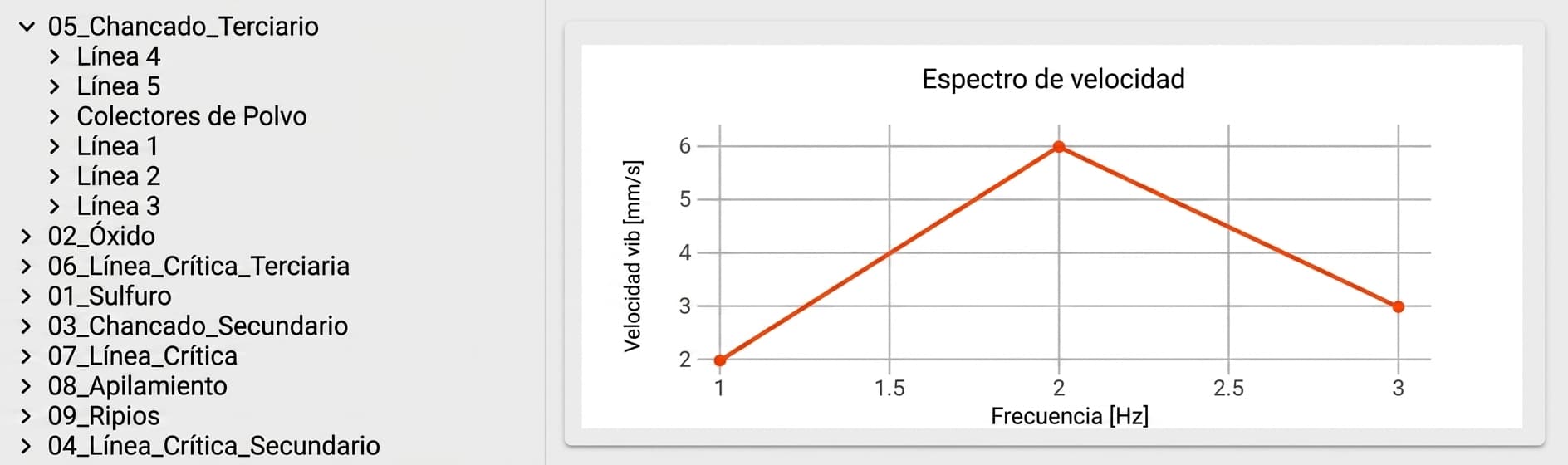
Charts were a fundamental part of the experience.
The new view needed to incorporate different representations of vibration data and update them according to the selected sensor.
The visualization needed to allow the analyst to quickly interpret the sensor's behavior and detect patterns associated with potential problems.
Making Charts Interactive
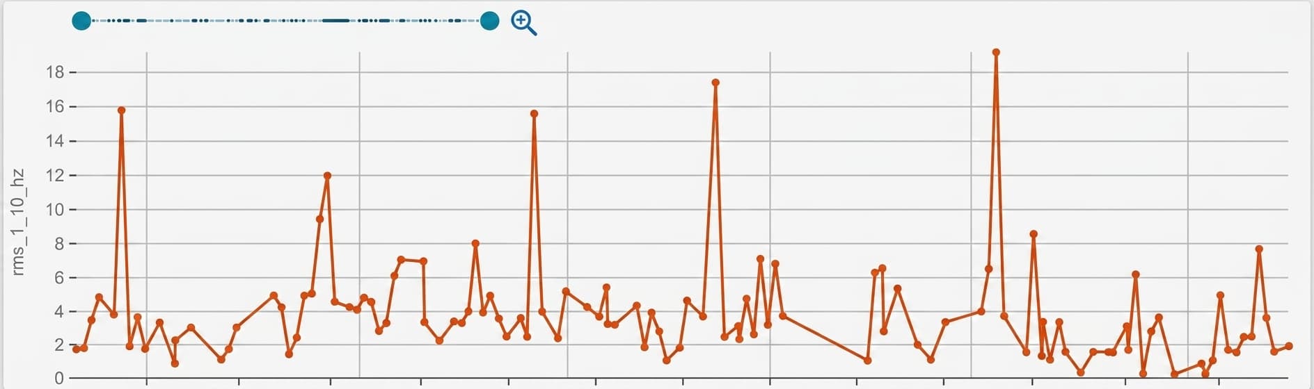
Interaction with charts kept evolving.
A Material UI control was incorporated to select the X-axis range and zoom into the data. Each chart needed its own control because the axes could represent different ranges.
Iterating on Feedback
The visualization experience didn't end with the first implementation.
Feedback received during the project led to different adjustments, such as:
• Reducing the size of chart points
• Keeping initial and final dates visible
• Incorporating a filter for unseen elements
• Sorting alerts by date
It was also detected that zoom worked correctly on some charts but was less intuitive on other visualization types. This led to evaluating alternative chart libraries.
The interface evolved from real usage and feedback received during development.
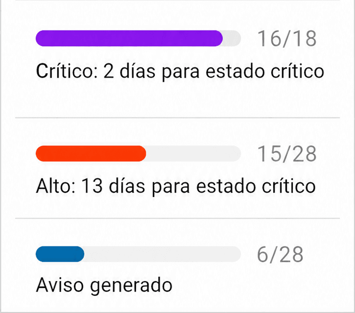
Criticality as Visual Language
Alerts needed to quickly communicate their criticality level.
Four levels were defined:
| Level | Range |
|---|---|
| Level 1 — Critical | 80–100% |
| Level 2 — High | 50–80% |
| Level 3 — Medium | 20–50% |
| Level 4 — Monitoring | 0–20% |
Alert Management
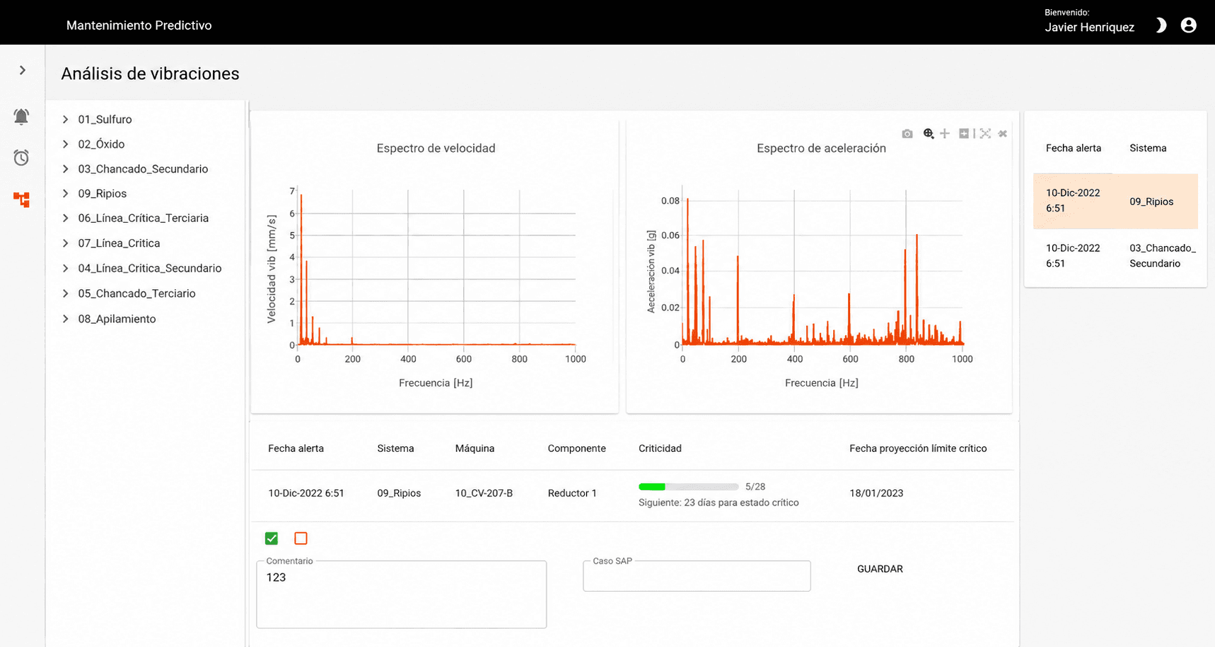
Alert information could be viewed along with actions to modify its status.
The form included:
• Accept
• Reject
• Comment
• SAP Code
The form was designed to appear when selecting an alert or a sensor with an active alert.
Responsive Design
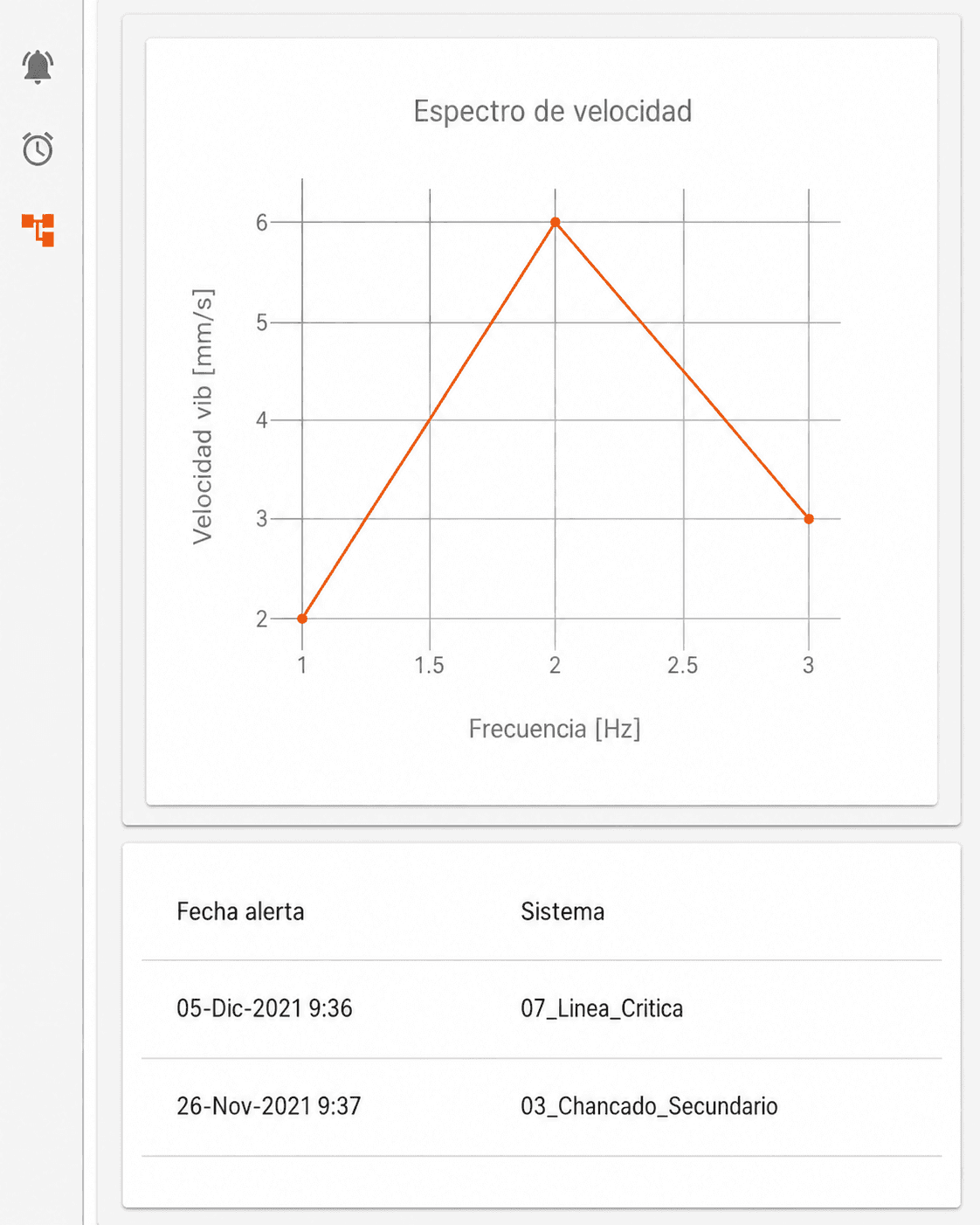
The view needed to adapt to different resolutions.
This involved reviewing components and modifying the layout to make it responsive.
Additionally, one of the system iterations was specifically oriented toward improving chart visualization on lower-resolution screens.
Interaction Architecture
One of the important frontend decisions was using Redux to handle information that needed to be shared between different components.
For example, selecting a sensor in the tree would update Redux state, which would then trigger chart updates and display the selected sensor information.
Tech Stack
- React — Interface development and component composition
- Redux — State management for sensor selection and cross-component communication
- Material UI — Interface components, including controls for chart interaction
- Data Visualization — Vibration data visualization and interaction
- Responsive Design — Interface adaptation to different resolutions
- REST APIs — Metadata retrieval and requests for chart updates
Results
The result was a new vibration analysis view that brought together in a single experience:
- Sensor hierarchy navigation
- Vibration data visualization
- Alert management
- Criticality assessment
- Alert actions and status tracking
What I Learned
- Design around the user flow — The interface wasn't built as independent components. Selecting a sensor had to trigger changes across different application areas
- Global state should have a purpose — Redux was mainly used to keep component selection synchronized, avoiding disconnected local states
- Visualization also needs iteration — Charts weren't a closed functionality in the first version. Feedback led to modifying sizes, filters, interaction, and evaluating new visualization alternatives
- Responsive must be considered from the layout — An interface with multiple charts, navigation tree, and side panels requires careful thought about how information reorganizes when space decreases
Summary
From the initial alerts dashboard to the new vibration analysis view, the project involved data visualization, chart interaction, sensor hierarchies, state management, criticality rules, forms, and responsive design.
My main contribution was in the frontend development of these experiences using React and Redux, connecting interface interactions with the data needed for analysis.
A project where the challenge wasn't just visualizing data, but connecting different information sources within a coherent analysis experience.